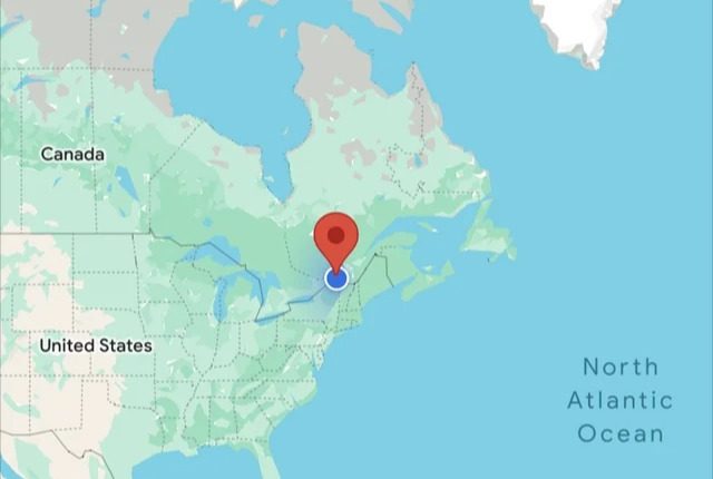
GOOGLE Maps appears to have taken a wrong turn in a recent update that users hate.
The tech giant unveiled a revamped colour scheme for its hugely popular navigation app.
But people who have used the service for years are saying it looks worse.
One person joked that it’s so awful the changes are “making my eyes bleed”.
For some reason, Google has decided to switch roads from white to grey.
Spots with water now have a paler blue tone, while forestation uses a much darker shade of green to before.
Read more about Google Maps
The route indicator has also been retouched, with a much brighter blue.
Social media has been rife with complaints about the shake-up.
“Not a fan,” one user wrote on Reddit.
“Just didn’t like them when I started seeing them a week or so ago.
Most read in Tech
“Not as easy to read for me. I’d switch back to the old colors if I could.”
Another wrote: “Classic Google, changes what was totally fine and makes it worse for no apparent reason.”
However, not everyone is against the move.
“Ooo i like the new one but since people have noted some legibility issues i think it would be cool if they let you choose between a couple pallets,” a third person commented.
It’s not the first time Google has been criticised for making unwelcome changes to its apps.
The firm owns Fitbit and was recently forced to reintroduce features after a huge backlash from users.
We pay for your stories! Do you have a story for The Sun Online Tech & Science team? Email us at [email protected]
This post first appeared on Thesun.co.uk


