Opinions expressed by Entrepreneur contributors are their own.
You’re reading Entrepreneur Middle East, an international franchise of Entrepreneur Media.
We’ve seen Elon Musk talk about his X.com dream since 1999. There is enough lore written about his fascination with the letter, from his son’s name, to how he named Tesla models the “S,” “3,” “X,” and “Y,” such that they would combine to spell “S3XY.”
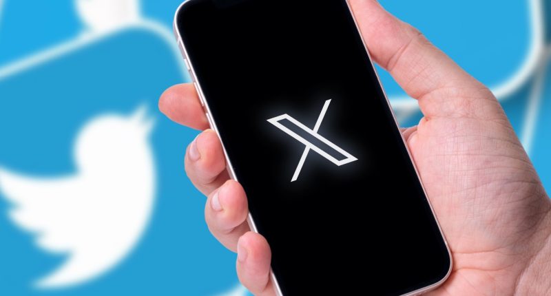
When it comes to design, Twitter’s rebrand seems to go beyond the ideas of form versus function, and into a new territory that could be described as ego over form and function. There’s a lot to unpack, from the billions in brand value losses, to the uproar of brand analysts and designers, who took it as an offense to their craft and even livelihoods.
First, let’s look at the facts. X (formerly Twitter) has lost an estimate of 47-66% of its valuation since Musk took over. Its ad revenue has been slashed by half, as admitted by Musk himself. And recently after the rebrand, brand analysts have speculated that the name change could cost the company up to US$20 billion in value. So, is there a way to gain a deeper understanding of such a rare case study in branding, and perhaps arrive at early sketches for a playbook for the future of brands?
Culturally speaking, X holds many meanings, amongst them a common association with the undefined, or the unknown. It can be speculated that having a name that signifies no meaning is a deliberate strategic move. A blank, clean slate to start fresh and hold new meaning. But it’s also important to note how it serves as an extension to Musk’s personal brand.
In an interview with TIME magazine, Todd Irwin, Chief Strategy Officer at Fazer, a New York-based brand strategy and creative agency said, “One thing working in Musk’s favor: The Elon brand. His personal brand might be more powerful than the Twitter brand.” This is what the move is about, it’s not about the meaning attached to it, but it attaches more meaning to Elon’s brand.
The rebrand also follows a lineage of idiosyncratic Musk tactics that thrive on creating buzz, and capturing as many eyeballs as possible. It started with mass layoffs that cut headcount by 70%, then his introduction of the $8 blue checkmark, and, recently, his suggestion to remove the block feature, among many.
The one constant that all these tactics achieve are tons of engagement- despite a large chunk of such engagement being negative. Thus, his use of a simplistic, unremarkable X for a logo isn’t lazy; it’s on-brand.
Musk realizes that the only thing the logo needs to be is legible- any other brand perception will come from all the buzz, or antics, around it. When designers from all over the world jumped at the opportunity to criticize it, design “better” logos, or even make memes about it, they gave him exactly what he needed. In practically no time, X’s logo became a highly recognized symbol.
Ultimately, this demonstrates one idea clearly- the necessity of aesthetic quality in logos is quickly diminishing in our nascent post-nuance era. Aesthetics, or beauty, as Sagmeister & Walsh call it, used to serve a huge function for brands, and that is attraction and appeal. Today, Musk demonstrates that this function can be served by mere controversy and publicity stunts.
Also, we shouldn’t forget that X is another step in repositioning to a different kind of audience. After leaning into his polarizing character, Musk is clearly not just gambling on the outrage of his critics, but also his most devout followers. Utilizing his personal brand as an extension to X, he does not shy away from weaving politics into his brand. By turning political discourse ideas like “free speech” into trendy keywords, reinstating banned users like Donald Trump and Andrew Tate and banning Washington Post journalists from the platform, he immediately appeals to a certain demographic that we’re all too familiar with.
So, why is this what we call “an inverse masterclass in branding”? Because it demonstrates arguably unprecedented strategies of brand risk-taking, which can serve as a cautionary tale for every tech CEO launching a new brand or contemplating a rebrand.
Financially, X lost, and is speculated to lose more, as investors and advertisers are never fans of controversy, inconsistency, or unpredictability. The attachment to a 20-year-old idea for personal reasons hardly resonates en masse at best, and is a public embarrassment at worst.
However, we also see an extreme example of how logos are empty vessels that only time can give significance too, and so, being too hung up on aesthetics when it comes to logos can be a waste of time. As graphic designer and design critic Michael Bierut once said: “Logos need to have a long life, not win points in a discussion.”
Only time will tell if Musk’s gambles will pay off- but realistically, very few can afford to lose what he has lost with these risks.
This article is from Entrepreneur.com


