The design phase of an email signature program is of critical importance, not only in terms of the initial project’s success but also because oversights/mistakes at this stage can have serious adverse consequences down the road.
On the low end of the continuum, these can manifest as increased complexity and difficulty in managing the program, and on the high end, in an outright inability to add features due to database “dead-ends”…
A multitude of factors must be considered when designing an email signature program – things such as:
- Should users be allowed to edit their signatures?
- Should a more streamlined signature be utilized when replying to messages?
- How will the signature appear when displayed in dark mode?
- Should there be an option to include the user’s headshots?
- Which social media platforms should be featured?
- How will the “plain-text” version of the signature be prepared and installed?
- Which data fields should be mandatory and which ones should be optional?
- What’s required to create a visually outstanding, but also reliable, design?
- and many more…
It’s easy to get so wrapped up in the near-term project requirements that the long-term implications are overlooked. As good as your program may be on day one, if it becomes increasingly difficult to manage over time you may find yourself needing to go back to the drawing board to start over. So, how can the down-the-road “gotcha” problems be avoided?
These two simple rules will prevent a program from getting out of hand:
- Avoid excessive “user-specific” customization.
- To the extent possible, minimize the number of templates you’ll need to support.
Avoiding excessive “user-specific” customization will be discussed in a future post, here we’ll focus on minimizing the number of templates in use.
Avoid Unnecessary Templates
Generally speaking, the quickest and easiest approach to satisfying diverse requirements is through the construction of a new template option – little thought is required, just clone your existing template, add (or remove), some content options, and voila, job done! Creating two “single purpose” templates is usually the quickest way of meeting dual requirements.
Take heed though, you’re likely to pay many times over, down the road, for this quick shortcut taken today.
Why? Because your email signature program will have a lifespan measured in years, and over these years, maintenance will be required. This maintenance can take on many forms:
- Changes to branding – new logo/colors.
- Changes to social media presence – a decision to remove Twitter, etc.
- Changes within social media presence – Twitter becomes X, and Instagram updates its icon.
- Technical changes to email – “dark mode” emerges / O365 web drops support of “nowrap”.
- Changing legal requirements – corporate attorneys require updated confidentiality language on your signatures.
- Changing external landscape – fax becomes obsolete, online meeting scheduling becomes ubiquitous.
- And many, many, others…
While these changes are generally easy to execute, they require one or more touchpoints on every template in use. So, if you’ve built your program around a minimal number of multi-function templates, you’re golden. Conversely, if you’ve allowed your template library to grow unnecessarily large and find yourself needing to update ten or twenty different templates, even the smallest of changes can become aggravating. Larger changes, that require testing, can become downright daunting.
Think “Swiss Army Knife”
To minimize future maintenance efforts, use the “Swiss Army Knife” approach – create one (or just a few), massively flexible, template(s) to accommodate all user requirements. This can be done by providing users with a set of options in whatever signature configuration portal you use. These typically cover items such as:
- Inclusion of a headshot
- Location
- Logo (if the signature program is for multiple brands)
- User-customized social media links
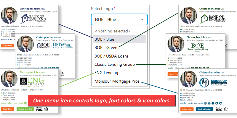
Let’s take a look at a few of these, starting with a multi-brand example:
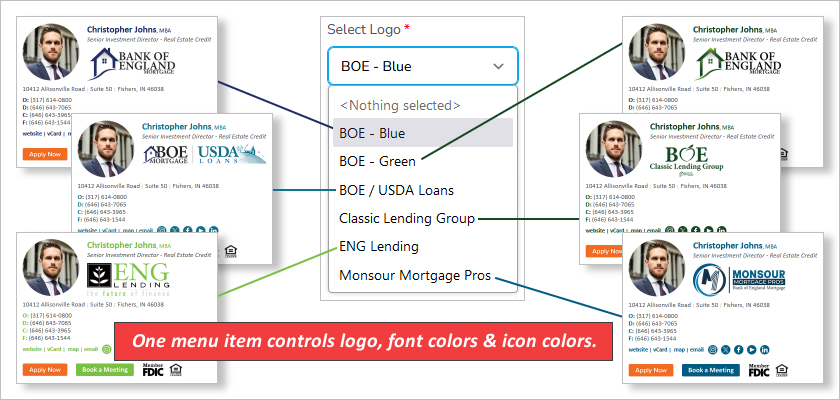
In this case, a considerable amount of programming went into the development of a single drop-down menu to control not only the logo but also the font color of the user’s name, phone number labels, linked text, and the color of the social media icons. The result of this is that what would have normally been six templates to maintain, has now become one.
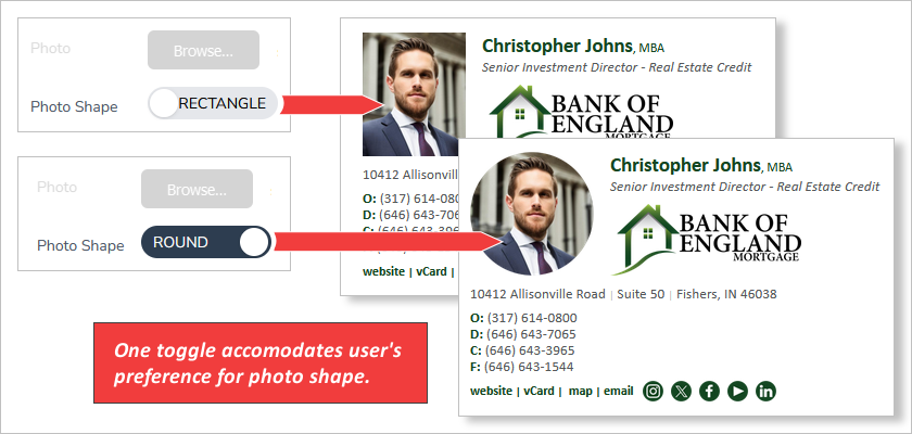
Because this signature program required an option for users to include either a rectangular or round headshot, this was programmed into one template (at the configuration level), rather than splitting the template into two:
Regarding locations, there are multiple approaches that can be used – often the easiest is to just provide fields for users to enter their location – street, suite #, city, state, and zip code. However, this leads to potential inaccuracies and inconsistencies, and sometimes just generally bad data entry (caps lock was left on, Los Angeles is entered as “LA”, etc.). To create the best results, it’s best to pre-code the address information for the user to select from, rather than asking them to type it in themselves. This is best done as a “locations” feature in the signature configurator (rather than creating and having to maintain multiple templates).
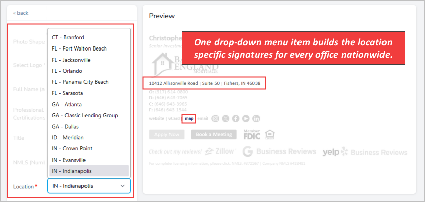
This company has 50+ locations, so clearly the menu select feature makes sense compared to the alternative of a specific template for each location.
In some cases, you may find that individual users need to feature their own social media, rather than to company’s social media (especially true in the real estate industry). By building options into the template, this can be accomplished without the need for a customized template for each user.
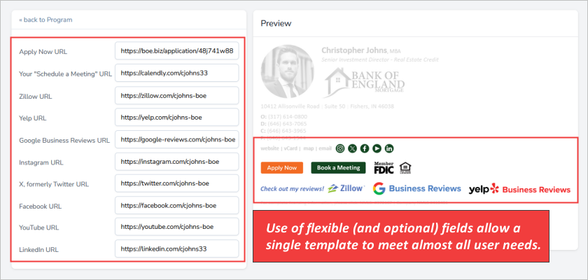
The four screenshots above illustrate the use of a single template, covering all the needs of a complex signature specification for a multi-brand, multi-state, mortgage broker. While the initial programming required to set up a template like this is considerably more complicated, the down-the-road maintenance is massively simplified. This pays off in three ways:
- Less time is required for maintenance tasks.
- Less stress each time template maintenance is required.
- Reduced possibilities of mistakes (and the adverse impact they have on users).
Unless you specifically think about it, it’s likely that you won’t notice the upside of minimizing the number of templates in your program. Conversely though, if you allow your template library to grow unnecessarily large, you will absolutely notice the downside – over and over again!
If you’re not sure how to build this type of flexibility into your program, using an email signature service like Dynasend is an easy way to ensure that the platform you’re providing is designed for efficiency, stress-free, and maintainability. The Digital Agency Network’s Email Marketing Blog is also a great resource for finding tips on how to maximize the effectiveness of your email signature program.
