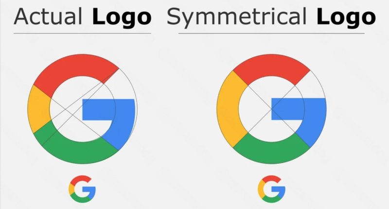
WHEN looking at the G in the Google logo you may think it’s perfectly symmetrical to be pleasing to the eye.
The tech giant has billions of users but not everyone takes a closer look at the logo to spot a hidden error.
It’s not technically an error as the G has been slightly adapted to be imperfect.
This helps it look perfect to the average human eye.
The G in Google’s logo is not actually a perfect circle.
It’s imperfect due to a design technique called “overshooting”, according to Medium.
It’s a technique used in typography, which is the art of making text look appealing.
By using overshooting the G actually looks perfect to the human eye.
This is despite being mathematically imperfect when you draw a full circle around the letter.
A Reddit user edited the G so it was a full circle and received mixed reactions in the comments.
Most read in News Tech
“Created an Actually Symmetrical Google Logo. How would you feel if google used it?” they asked in a popular Reddit forum.
“The original looks more optically balanced,” one person wrote.
“Original looks worse to me now tbh,” another said.
“There is a reason Google used the first one,” another Redditor wrote.
It’s thought Google’s mostly white website plays a role in requiring the G to be slightly imperfect.
This is because the human eye can see shapes differently based on what color background they’re on.
The fact the logo is multi-colored could also be to blame.
Companies often consider color composition in their logos to make them seem more appealing.


